A sticker can fill an online product photograph and still leave the buyer wondering whether it is the size of a coin or a coaster. The clearest solution is to give the listing two uncomplicated images: a clean hero frame that shows the artwork and finish, followed by a contextual frame that shows physical scale.
Do not ask one photograph to perform both jobs. Props that make size obvious can distract from fine artwork, while a perfectly isolated product image removes the familiar objects that help a buyer judge dimensions. Separate frames let each answer one question well: “What does it look like?” and “How big is it?”
Begin with a clean hero image
The hero image should make the sticker immediately legible. Place it on a plain surface with enough contrast to preserve its silhouette, especially if the design has a white border. Keep the composition product-first and use soft, even light. Adobe’s product-photography guidance similarly recommends simple compositions, restrained props and lighting that keeps attention on the product.
Photograph a flat matte sticker nearly straight on when the printed design is the main attraction. Use a slight camera angle when the edge, surface texture or laminate needs to catch a controlled highlight. The angle should reveal a physical quality rather than turn a circular sticker into an unexplained oval.
Before photographing a design made from an image, inspect its silhouette and border at the finished size. Our guide to turning a photograph into a die-cut sticker explains how subject choice, edges and crops affect readability.
If you still need physical samples for the shoot, CustomStickers custom stickers and material options offer a relevant place to compare the forms and finishes you intend to photograph.
Make a separate frame for scale
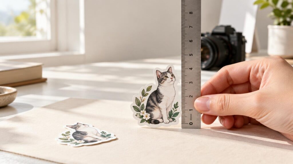
In the second image, place the sticker beside or on one familiar object. A notebook, water bottle, laptop or hand can give the eye an immediate scale cue. Keep that object quiet: it should establish context without obscuring the sticker’s outline or competing with its artwork.
Choose a reference that suits the likely use. A laptop works for a decal meant for electronics, while a bottle makes sense for an outdoor or waterproof design. A notebook is useful for small decorative stickers. A hand feels natural, but hand sizes vary, so it remains a visual cue rather than a measurement standard.
Always state the sticker’s measured width and height in the listing or caption. Context helps a buyer imagine the object; written dimensions confirm its actual size.
Control perspective before changing lenses
The nearest object can look disproportionately large when the camera is close and the sticker and reference sit at different distances. This is principally a viewpoint problem. As MIT’s explanation of linear perspective shows, camera position determines the relative apparent sizes of objects at different depths; focal length then changes how tightly that view is framed.
If the sticker looks enormous beside the notebook or bottle, move the camera farther away and reduce the depth gap between them. Then use a longer focal length, if your room and equipment allow it, or crop the resulting frame. Nikon’s focal-length guide describes longer focal lengths as providing a narrower angle of view and greater magnification.
For a flat arrangement, keep the camera sensor plane parallel to the surface when you want parallel edges to remain visually parallel. If a notebook seems to taper dramatically or a rectangular sticker becomes wedge-shaped, first correct the camera angle rather than trying to repair the geometry in editing.
Let reflections describe the finish
Glossy and holographic stickers need a highlight, but not a white blaze that erases the illustration. Start with a broad, diffused light source. If glare covers the design, move the light sideways or higher, alter the camera position slightly, or rotate the sticker. The useful highlight should reveal sheen while leaving important lines and colors visible.
For matte stickers, look for the opposite failure: lighting so flat that paper texture and edge definition disappear. A small change in light direction or camera angle can provide enough shadow and tonal variation to describe the surface without making it look rougher than it is.
Add detail photographs only when they answer a question
An angled close-up earns its place when buyers need to inspect laminate sheen, edge quality, texture or layered construction. Keep the focus on the relevant area and retain enough of the design to orient the viewer. A plain matte sticker whose main qualities are artwork and size may not need this frame at all.
For a pack, include one orderly group image showing all included designs. Avoid overlapping stickers so heavily that the buyer cannot identify them or estimate their individual sizes. Follow it with isolated views of any designs whose details become too small in the group frame.
Keep color consistent across the listing
A product gallery feels unreliable when the same yellow turns warm in one frame and greenish in the next. Use the same light source, background and camera position throughout the set. A tripod helps preserve a successful angle while you change stickers or scale objects.
Photograph a neutral reference under the final lighting when practical, then make one careful white-balance correction and synchronize it across images made under those conditions. Adobe’s Lightroom Classic guidance provides temperature, tint and white-balance selector controls, and advises against sampling clipped whites or spectral highlights with the selector.
White balance can remove a modest color cast; it cannot make photographs from radically different lighting conditions match gracefully. Stabilize the lighting first, then edit exposure, contrast and color. Keep saturation restrained enough that the listing remains a credible description of the physical sticker.
Use a simple listing sequence
A focused gallery might contain the following frames:
- A clean hero image showing the complete artwork and cut shape.
- A contextual image with one familiar object providing scale.
- An angled finish or edge detail when the material makes it useful.
- A group image showing every design included in a pack.
- Additional isolated views for designs that become unclear in the group image.
- A caption or listing field confirming the measured dimensions with units.
Keep the hero and context frames visually related through consistent light, background tone and editing. They should feel like two views of the same object, not photographs taken in different rooms during different seasons.
Make one final size test
Before publishing, view the gallery at the small size buyers will first encounter. The artwork should remain recognizable in the hero image. In the context image, the scale object should be identifiable without explanation, and neither object should look stretched or disproportionately enlarged.
Then cover the written dimensions and ask whether you can make a reasonable size judgment from the photograph alone. Uncover them and check that the stated measurements remove any remaining ambiguity. That is the stopping point: one frame shows what the sticker looks like, another shows how it occupies the world, and the dimensions provide the final confirmation.
Frequently Asked Questions
What should I use as a size reference for a sticker?
Choose one familiar object that fits the sticker’s likely use: a notebook, bottle, laptop or hand. Treat it as a visual cue, then confirm the exact width and height in the listing because familiar objects vary in size.
Why does the sticker look too large beside the scale object?
The camera is probably too close, or the sticker and reference are at different depths. Move farther away, bring them closer to the same plane, then use a longer focal length or crop to restore the framing.
How do I photograph a glossy or holographic sticker without hiding the design?
Begin with a broad, diffused light. If glare covers the artwork, shift the light, camera or sticker until one restrained highlight describes the finish while the printed lines and colors remain visible.
Does every sticker listing need a close-up detail photograph?
No. Add one when laminate sheen, texture, edge quality or layered construction matters. For a simple matte sticker, a clean hero image and a separate scale frame may communicate everything the buyer needs.
References
- Product photography tips to help increase sales | Adobe
- Pinhole Image Formation and linear perspective — Computational Photography
- Understanding Focal Length
- Product photography: Tips & techniques – Adobe
- Reflection photography: A beginner's guide – Adobe
- Adjust colors in Lightroom on mobile
- How to adjust image tone and color, and work in grayscale in Lightroom Classic