Blog

  • Sticker Inspiration: Ideas For Custom Stickers That Actually Look Good

    Sticker inspiration can come from almost anywhere: old cartoons, coffee shop windows, concert posters, road trips, inside jokes, packaging labels, journal pages, or the mildly suspicious pile of stickers already living on your laptop. The trick is not finding ideas. The trick is turning those ideas into custom stickers people actually want to use.

    Whether you are designing stickers for a shop, a brand, an event, a water bottle, or just because your notebook looks too responsible, here are practical sticker inspiration ideas you can use right away.

    Start With The Sticker’s Job

    Before picking a style, decide what the sticker is supposed to do.

    A sticker for a small business package has a different job than a sticker for a skateboard. A planner sticker needs to be useful and readable. A laptop sticker needs personality. A product label needs clarity. A funny sticker needs the joke to land in about half a second.

    Good sticker inspiration usually starts with one of these goals:

    Make someone laugh
    Show identity or taste
    Decorate a surface
    Label something clearly
    Promote a brand
    Celebrate an event
    Create a collectible design
    Make packaging feel more finished

    Once you know the job, the design choices get easier.

    Retro And Y2K Sticker Inspiration

    Retro stickers are popular because nostalgia does half the work for you. People already have feelings attached to cassette tapes, checkerboard patterns, arcade graphics, roller skates, smiley faces, chunky type, lava lamp colors, and early internet weirdness.

    Good retro sticker ideas include:

    90s computer windows
    Pixel art icons
    Old-school diner signs
    Cassette tapes and mixtapes
    Roller rink graphics
    Vintage mascots
    Sunset stripes
    Chrome lettering
    Holographic hearts
    Vaporwave grids

    This style works especially well for laptop stickers, water bottle stickers, music merch, artist packs, and sticker sheets. If the design looks like it could have fallen out of a shoebox full of childhood junk, you are probably in the right neighborhood.

    Minimalist And Typography Stickers

    Minimalist stickers are great when you want something clean, modern, and not screaming at people from across the room. They work well for planners, laptops, phone cases, packaging, and office items.

    The best typography stickers are short. Very short. A sticker is not the place for a paragraph unless your goal is to make strangers squint.

    Try phrases like:

    Keep Going
    Stay Weird
    Tiny Wins
    Make It Simple
    Good Enough Club
    Less But Better
    Not Today
    Booked And Busy
    Currently Loading

    Pair simple words with clean type, a small icon, or a limited color palette. This is also a good direction for brand stickers because it feels polished without trying too hard.

    Nature And Botanical Sticker Ideas

    Nature stickers are easy to like and easy to use. They fit journals, laptops, water bottles, hiking gear, stationery, packaging, and small gift items.

    Popular nature sticker inspiration includes:

    Mushrooms
    Wildflowers
    Houseplants
    Succulents
    Mountains
    Moons and stars
    Sunbursts
    Bees
    Butterflies
    Forest animals
    Ocean waves
    Desert plants

    Botanical stickers can go soft and delicate, or bold and outdoorsy. A tiny line-art sprig feels completely different from a bright waterproof mountain decal, even though both live in the same broad category.

    Cute, Kawaii, And Food Stickers

    Cute food stickers are weirdly powerful. A boba cup with a happy face should not work as well as it does, but here we are.

    Kawaii-style stickers usually use simple shapes, soft colors, rounded features, and expressive faces. Food pairs are especially good because they create instant little characters.

    Try ideas like:

    Boba tea with blush cheeks
    Peanut butter and jelly
    Happy sushi rolls
    Sleepy dumplings
    Donut characters
    Avocado halves
    Tiny ramen bowls
    Strawberry cats
    Frog cupcakes
    Toast with feelings

    This style works well for sticker sheets, planner stickers, kids’ stickers, artist merch, and Etsy shops. It also gives you room to build collections, which is useful if you want customers to buy more than one design.

    Hobby And Community Stickers

    Some of the best sticker inspiration comes from specific communities. Broad designs can sell, but niche designs often connect faster because they feel like an inside joke.

    Think about stickers for:

    Gamers
    Book lovers
    Teachers
    Plant people
    Coffee drinkers
    Board game fans
    Makers and crafters
    Cyclists
    Campers
    Pet owners
    Fantasy readers
    Dungeons and dragons groups
    Magic: The Gathering players
    Pinball fans
    Small business owners

    A sticker that says “I like books” is fine. A sticker that says “treat yo’ shelf” beside a tiny bookshelf has more personality. Specific wins.

    Brand Sticker Inspiration For Businesses

    For a business, sticker inspiration should start with where the sticker will be used. Packaging stickers, thank-you stickers, product labels, giveaway stickers, and logo decals all need slightly different thinking.

    Good business sticker ideas include:

    Logo stickers for packaging
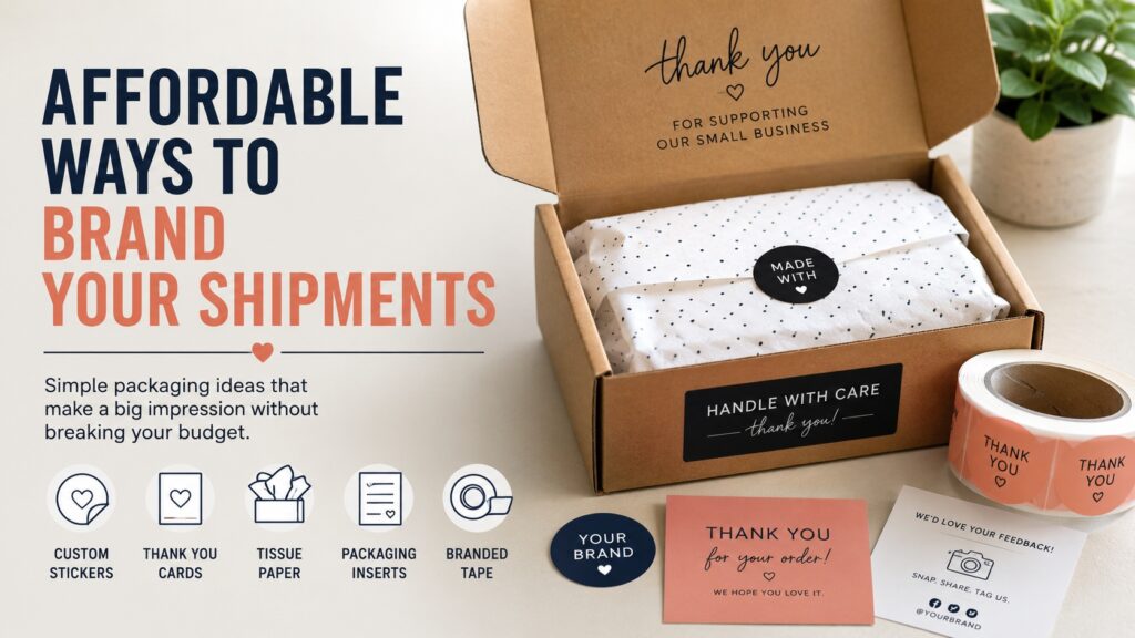
    Thank-you stickers for orders
    QR code stickers for promotions
    Product label stickers
    Event giveaway stickers
    Branded laptop decals
    Seal stickers for envelopes
    Limited-edition campaign stickers
    Seasonal packaging stickers
    Small freebie stickers for customers

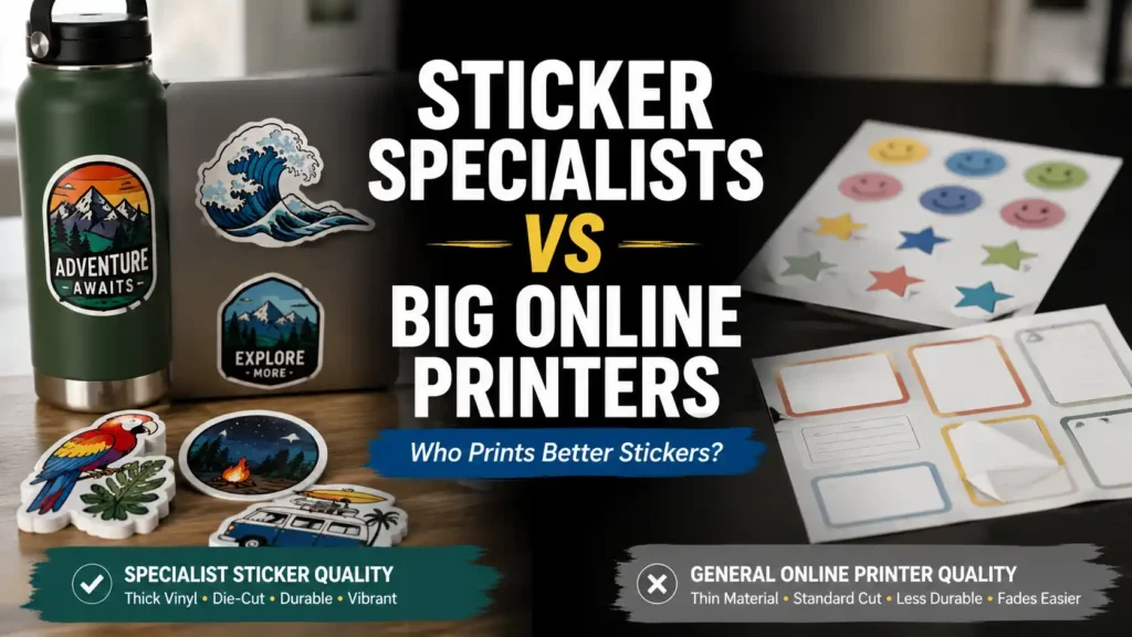
    If you want to print your own designs, CustomStickers.com is a strong option for custom vinyl stickers, die-cut shapes, sticker sheets, and durable laminated stickers. It is especially useful when you want real physical stickers for packaging, selling, or giveaways instead of just mockups on a screen.

    Sticker Sheet Inspiration

    Sticker sheets are great because they let you turn one idea into a small world. Instead of selling one mushroom sticker, you can sell a forest sheet with mushrooms, leaves, bugs, stars, and a tiny raccoon who looks like he knows too much.

    Good sticker sheet themes include:

    Self-care day
    Coffee shop items
    Garden tools
    Space cats
    Book club night
    Retro desk setup
    Camping weekend
    Birthday party icons
    Wedding planning icons
    Teacher reward stickers
    Pet portrait mini stickers
    Small business packaging icons

    Sticker sheets work best when each sticker can stand alone, but the whole sheet still feels cohesive.

    Placement Ideas For Better Sticker Designs

    A good design should match the place it is likely to go. Placement matters more than people think.

    Laptop Stickers

    Laptop stickers can be bold, funny, artsy, or identity-driven. They often work best as die-cut designs with strong silhouettes. If the shape is recognizable from a few feet away, that is a good sign.

    Try:
    Large central sticker plus smaller supporting stickers
    Corner clusters
    A themed collage
    One clean oversized design
    A row of small icons along the edge

    Water Bottle Stickers

    Water bottle stickers need durability. Use vinyl, not paper, if the sticker will deal with moisture, handling, and cleaning.

    Try:
    Outdoor themes
    Gym jokes
    Name stickers
    Travel decals
    Mascots
    Bold typography
    Waterproof die-cut art

    Planner And Journal Stickers

    Planner stickers need to be readable and useful. Tiny design details are fine, but the function should stay clear.

    Try:
    Habit trackers
    Mood icons
    Appointment labels
    Goal stickers
    Tiny quotes
    Seasonal accents
    Tabs and dividers
    Decorative borders

    Packaging Stickers

    Packaging stickers should reinforce the brand without getting in the way. Think clean, clear, and easy to apply.

    Try:
    Thank-you seals
    Logo stickers
    QR code stickers
    Flavor or scent labels
    Limited batch labels
    Care instruction stickers
    Fragile or handmade labels

    Color Palette Ideas

    When you are stuck, pick a color palette before you pick the artwork. It narrows the field and keeps the design from turning into a visual junk drawer.

    Try these directions:

    Pastel pink, cream, and soft brown for cozy designs
    Forest green, tan, and black for outdoor designs
    Neon purple, blue, and pink for Y2K designs
    Cream, red, and navy for vintage labels
    Black and white for minimalist typography
    Orange, teal, and yellow for retro summer stickers
    Muted sage, clay, and ivory for botanical stickers

    Limit the palette if the sticker is small. Tiny stickers with too many colors can look messy fast.

    Quick Sticker Inspiration Prompts

    Use these as starting points when your brain is pretending it has never seen a sticker before.

    A tiny animal doing a human job
    A food item with an attitude problem
    A fake badge for a very specific personality type
    A retro logo for a made-up club
    A sticker based on your favorite inside joke
    A plant with a dramatic quote
    A mountain badge for a fictional trail
    A sticker sheet for a rainy day
    A laptop decal for people who overthink everything
    A planner sticker for small wins
    A packaging sticker that feels like a thank-you note
    A mascot version of your brand
    A sticker based on a phrase customers say often
    A collection around one color
    A sticker that looks like it came from an old vending machine

    How To Turn Inspiration Into A Finished Sticker

    Once you have an idea, simplify it. Stickers need strong shapes, readable text, and clean edges. A design that looks great as a poster may become muddy when printed at 2 or 3 inches.

    Before printing, check:

    Is the main shape clear?
    Can the text be read at the final size?
    Does the design still work without a background?
    Would it look good as a die-cut sticker?
    Does the color contrast hold up?
    Is the file high resolution?
    Will the sticker be used indoors or outdoors?

    If you are printing for sale, order a small test batch first. Screens lie. Printed stickers tell the truth, sometimes rudely.

    Final Thoughts On Sticker Inspiration

    The best sticker inspiration usually comes from a mix of style, purpose, and audience. Retro designs work because they feel familiar. Minimalist stickers work because they are easy to use. Cute food stickers work because apparently humans will bond with anything if it has little eyes. Community stickers work because people love seeing themselves in small, funny, visual ways.

    Start with one theme. Build a small collection. Print samples. Then pay attention to what people actually use, buy, and ask for again.

    That is where the best sticker ideas usually come from.

  • What Is the Best Place for MTG Proxies on a Budget?

    The best place for MTG proxies on a budget is ProxyMTG.com if your main priority is low per-card pricing, especially for full Commander decks, cube updates, and larger orders. PrintMTG.com is the better pick if you still care about budget but want a more polished ordering experience, strong card feel, and excellent print quality.

    The Budget Proxy Problem

    Magic is a great game, but the cardboard economy can get ridiculous fast. One minute you are “just upgrading a Commander deck,” and the next minute you are debating whether one land should cost more than your last grocery run. That is where proxies make sense for casual play, Cube, testing, and deckbuilding.

    When people ask, “what is the best place for MTG proxies on a budget,” they usually do not mean “what is the absolute cheapest possible way to get rectangles with card names on them.” They mean, “where can I get cards that look good, shuffle well, and do not make me regret saving money?”

    That is the important distinction. Cheap proxies that feel flimsy, print blurry, or arrive looking like a printer sneezed on them are not really a deal. They are just disappointment with tracking information.

    Best Overall Budget Pick: ProxyMTG.com

    ProxyMTG.com is the easiest recommendation for players who are watching cost closely. Their pricing drops aggressively as the order size increases, which is exactly what budget proxy buyers usually need. If you are printing a few cards, it is still affordable. If you are printing a full Commander deck or cube batch, the value gets much better.

    The biggest reason ProxyMTG.com works as a budget pick is that it is clearly built around real Magic players. You can browse cards, choose versions, build around a list, and order without needing to turn the process into a weekend craft project. That matters. A cheap proxy site is only useful if normal humans can actually use it.

    ProxyMTG.com is especially strong for:

    Full Commander deck proxies

    Cube updates

    Playtesting batches

    Replacing expensive staples in casual decks

    Players who want low pricing without a messy workflow

    The card quality also appears aimed at practical play, not just “good enough if you squint.” ProxyMTG lists premium S33 German black-core cardstock, UV coating, precision die cutting, and print-file enhancement to at least 300 DPI. Those details matter because budget proxies still need readable text, consistent sizing, and a decent in-sleeve feel.

    For most budget-focused players, ProxyMTG.com is the best first stop.

    Best Budget-Plus Pick: PrintMTG.com

    PrintMTG.com is the pick for players who still want affordable proxies but care more about card quality, finish, and the smoothness of the overall ordering experience. It is not always the cheapest at every quantity tier, but it offers a very strong balance of price, usability, and quality.

    PrintMTG.com is a better fit if you are picky about:

    Texture and card feel

    Print resolution

    Color quality

    Easy decklist ordering

    Custom cards or alternate designs

    Fast fulfillment

    The site supports decklist uploads, set/version selection, custom card creation, and browsing by Magic set. It also lists premium black-core playing-card stock, standard TCG sizing, a smooth finish, and typical production within about 2 business days. That is exactly the kind of setup you want when you are trying to get a deck built, sleeved, and playable without fuss.

    PrintMTG.com is not the “race to the bottom” choice. It is more like the smart value choice. You pay for a better finished product, but you are still avoiding the absurd cost of buying every real card for every casual deck idea.

    ProxyMTG.com vs PrintMTG.com for Budget Buyers

    If budget is the main concern, ProxyMTG.com has the edge. Its large-order tiers are very aggressive, and the site feels purpose-built for people printing real deck quantities.

    If quality and ordering experience matter just as much as price, PrintMTG.com becomes very compelling. It is still affordable, but it feels more premium. That makes it the better recommendation for players who do not just want cheap proxies. They want proxies that feel good in a sleeve and look clean on the table.

    Here is the simple version:

    Choose ProxyMTG.com if you want the lowest practical budget pick.

    Choose PrintMTG.com if you want the best balance of budget, quality, and polish.

    Both are better choices than printing paper slips at home unless you genuinely enjoy cutting out tiny rectangles like you are serving a sentence.

    Why Not Just Pick the Cheapest Possible Option?

    You can always find cheaper ways to proxy cards. Home printing, paper inserts, and certain bulk custom card workflows can lower the cost. But those approaches usually add work, inconsistency, or annoying setup steps.

    For casual MTG players, the best budget option is not always the absolute lowest per-card price. It is the one that gives you playable cards without wasting your time. A proxy order should help you play more Magic, not create a second hobby called “printer troubleshooting.”

    That is why ProxyMTG.com and PrintMTG.com stand out. They sit in the practical middle: affordable enough to make deckbuilding easier, but polished enough that the cards still feel like real game pieces.

    Final Verdict

    So, what is the best place for MTG proxies on a budget?

    ProxyMTG.com is the best budget recommendation overall. It has strong tiered pricing, no-minimum ordering, and a workflow that makes sense for Commander decks, cubes, and bulk playtesting.

    PrintMTG.com is the best upgrade pick. It is still budget-friendly, but it leans harder into card quality, smooth ordering, and a more premium feel. If you want proxies that look sharp, shuffle cleanly, and do not feel like a compromise, PrintMTG.com is the safer quality-first choice.

    For most players, the answer is simple: start with ProxyMTG.com if price is the deciding factor. Choose PrintMTG.com if you want the better overall product while still staying far below the cost of buying every expensive card outright.

  • How To Personalize Online Wedding Invitations Without Making Them A Mess

    TLDR

    • The best online wedding invitations are clear before they are clever.
    • Start with the guest experience: what they need to know, where they reply, and where the extra details live.
    • Customize the parts people actually notice: tone, wording, color, photo, and RSVP flow.
    • Keep the main invitation light. Move travel, registry, parking, and schedule details to the wedding website.
    • If you want a matching printed suite too, a print-focused option like PrintInvitations or a broader custom printer like Printiverse can fit well.

    This post helps engaged couples customize online wedding invitations by explaining what to personalize, what to simplify, and what to move to a wedding website, so they can send invitations that feel personal and easy to use.

    Most online wedding invitations get cluttered for one simple reason: people treat them like a junk drawer. Every detail gets tossed in. Dress code. Registry note. Parking note. Hotel block. Shuttle timing. Rehearsal dinner mention. Meal choice. Three fonts. Two photos. A script typeface that looks pretty until your aunt tries to read the start time on her phone.

    There is a better way to handle online wedding invitations. And it is not about adding more design. It is about making better decisions in a better order.

    In my view, the cleanest digital invitations work like this: the invite sets the tone, the RSVP path is obvious, and the wedding website carries the heavier logistics. Once you build around that idea, customization gets easier fast.

    Start With The Click, Not The Color

    Most couples start by picking a template. I would start one step earlier.

    Before you customize anything, answer this question: What happens right after a guest opens the invitation?

    Do they click through to RSVP?
    Do they land on your wedding website?
    Do they scroll for more details?
    Do they text you because they still cannot tell where to reply?

    That is the real starting point.

    If the next step is fuzzy, the invitation will feel fuzzy too. The design can be beautiful and still fail. So before you choose your fonts or floral frame, decide the flow.

    A good online invitation should make these things instantly clear:

    • who is getting married
    • what the event is
    • when it happens
    • where it happens
    • how the guest should respond
    • where the extra information lives

    That is the job. Everything else is support.

    Decide What Belongs On The Invitation And What Does Not

    This is where a lot of the mess comes from. Couples try to make the invitation do everything.

    It should not.

    The invitation itself usually needs the headline details only. Think of it as the front page, not the whole file cabinet.

    Put these on the main invite:

    • names
    • date
    • time
    • venue name or city
    • event type if needed
    • RSVP instruction
    • website link if that is where the details or RSVP live

    Put these on the wedding website or details page:

    • travel notes
    • hotel block information
    • parking instructions
    • weekend schedule
    • registry links
    • accommodations
    • plus-one notes
    • meal questions
    • song requests
    • dress code explanation if it needs more than a few words

    This is one of the biggest advantages of online wedding invitations. You are not limited to one card, so you do not need to pretend everything belongs on one screen.

    And honestly, guests do not want a puzzle. They want the important facts first.

    Personalize The Parts That Actually Change The Feel

    You can customize a lot of things. That does not mean all of them matter equally.

    If you want your online wedding invitations to feel personal, focus on the choices that guests actually notice in the first few seconds.

    Wording

    The tone of the wording does more than people think.

    A formal wedding can use traditional wording and a little structure. A casual wedding can sound warmer and looser. A modern couple can keep it short and still make it feel thoughtful.

    What matters is consistency. If the invitation sounds very formal but the website sounds like a group chat, the whole thing feels stitched together.

    Typography

    This is one of the fastest ways to either clean up a design or wreck it.

    One display font plus one readable support font is plenty for most couples. If you use a script font, keep it in small doses. Names, maybe one short line, and that is probably enough.

    The words still need to work on a phone screen. That matters more than whether the capital letters look romantic.

    Color

    Color is powerful, but it works best when it is controlled.

    Pull from one real source: your flowers, venue, attire, season, or engagement photos. Then keep the palette narrow. A main text color, one accent, one background tone. Done.

    You do not need to prove that you own the entire color wheel.

    Photos

    Photos can work beautifully. They can also make an invitation harder to read in about three seconds.

    Use a photo if it helps set the tone and still leaves the text easy to scan. Skip it if the image is only there because the template has a blank space begging to be filled.

    Small Personal Touches

    This is where customization feels good without getting loud.

    That might be:

    • a monogram
    • a venue sketch
    • a custom line of wording
    • a subtle pattern
    • a favorite phrase
    • a small nod to the destination or season

    Tiny details usually age better than giant decorative decisions.

    Build The Wedding Website To Carry The Weight

    A lot of online wedding invitation problems disappear once the website is doing its job.

    The wedding website is where you can be more complete without making the invitation feel crowded. It is also where updates are easier if plans shift.

    As of April 2026, the major wedding platforms tend to split into a few lanes: design-first tools like Canva, invitation-and-RSVP platforms like Paperless Post and Greenvelope, and more connected planning systems like Joy and Zola that tie together websites, guest lists, RSVPs, and related planning tools.

    That matters because your customization options are only as good as the system behind them. If you want deep design control, one type of platform makes more sense. If you want guest tracking, custom RSVP questions, or multiple event responses, another type makes more sense. Joy, for example, emphasizes connected guest list and RSVP management, while Zola pushes the all-in-one website, registry, and planning angle. Greenvelope leans into the digital invitation experience itself, with animated envelope presentation and built-in RSVP tools.

    The practical takeaway is simple: do not choose a platform based only on the prettiest first template. Choose it based on how you want guests to move through the experience.

    Keep The Main Screen Clean

    This is the part where I get a little opinionated.

    If everything on the invitation is important, then nothing is important.

    A guest should be able to glance at the invite and understand the basics without hunting. That means space matters. Hierarchy matters. Short wording matters. Mobile layout matters.

    Good online wedding invitations usually feel calm. They do not try to prove how much effort went into them. They just work.

    So if you are editing and something feels crowded, do not immediately shrink the font. That is almost never the real fix. The real fix is usually to remove something from the main invitation and move it to the website.

    That one move solves more design problems than people expect.

    When A Hybrid Setup Makes More Sense

    Some couples start digital and then realize they still want printed pieces. Others start with paper and realize they want online RSVPs because entering fifty replies by hand sounds miserable.

    That is normal. You do not have to be loyal to one format.

    A hybrid setup can look like this:

    • digital save the date
    • wedding website with full details
    • printed main invitation
    • online RSVP
    • printed detail card only if needed

    Or the reverse:

    • online invitation
    • wedding website
    • printed keepsake invitation for close family
    • printed menus, programs, or thank-you cards later

    This is where PrintInvitations and Printiverse both make sense, but for slightly different reasons. PrintInvitations is built around invitation pieces that go together, like wedding invitations, save the dates, RSVP cards, detail cards, and matching stationery. Printiverse is broader and more flexible if you want to start from a template, upload your own design, review a proof, and print invitations as part of a larger custom print workflow.

    So if your online design starts to grow into a fuller printed suite, that is not a detour. It is often just the next logical step.

    A Better Order For Customizing Everything

    If I were giving a friend a simple order to follow, it would be this.

    First, decide where RSVPs happen.
    Second, decide what information belongs on the invitation.
    Third, build the wedding website.
    Fourth, choose the visual style.
    Fifth, proof it on a phone.
    Then proof it again.

    That order is less glamorous than starting with fonts. But it works better because it solves the structural problems first.

    And structure is what makes an invitation feel polished.

    Proof It Like A Tired Guest On A Phone

    This is the final test. Not whether you love the layout at full size on a desktop. Whether a guest can understand it quickly on a phone when they are busy.

    Check these:

    • Is the RSVP path obvious?
    • Is the website link easy to spot?
    • Can someone read the time without zooming?
    • Does the photo make the text harder to read?
    • Are the names, date, and venue correct?
    • If there are multiple events, is that clear?
    • If the website is doing the heavy lifting, is that clear too?

    And then have someone else read it. Not your partner. Not the person who helped choose the palette. Someone slightly outside the process.

    Fresh eyes catch boring mistakes. And boring mistakes are exactly the ones that cause unnecessary texts later.

    Conclusion

    The best online wedding invitations do not try to carry every detail. They set the tone, deliver the essentials, and make the next step clear.

    That is really the whole game.

    Personalize the wording. Personalize the look. Personalize the little touches that feel like you. But keep the structure simple. Let the wedding website handle the heavier information. And if you want a printed version or matching stationery later, build toward that on purpose instead of stuffing everything into one digital screen.

    That approach is cleaner, easier for guests, and a lot less likely to turn your invitation into a pretty little mess.

    FAQs

    Can I Make Online Wedding Invitations Feel Formal?

    Yes. Formal does not require paper. It requires good wording, clean typography, restrained design, and a clear structure. You can absolutely make a digital invitation feel formal without making it stiff.

    Should I Put My Registry On The Invitation?

    Usually no. It is cleaner to place registry information on the wedding website instead. That keeps the invitation focused on the event itself.

    Is It Better To Use Online RSVPs Or Printed RSVP Cards?

    For many couples, online RSVPs are easier and faster. But a hybrid setup can still make sense if you have guests who prefer paper or if you want a more traditional suite.

    Can I Design Online Wedding Invitations First And Print Later?

    Yes. That is a very common path. It is one reason to keep the design clean and organized from the start.

    What Is The Biggest Mistake People Make?

    Putting too much on the main invitation. Most design problems are really information problems in disguise.

  • Retractable Banner vs Vinyl Banner vs Fabric Banner: Which One Fits Your Event Best?

    TLDR

    • Retractable banners are best for indoor events, repeated travel, and quick setup.
    • Vinyl banners are best for outdoor durability, budget value, and simple hanging installs.
    • Fabric banners are best for polished indoor displays, trade show backdrops, and reduced glare.
    • Retractable is a display format, not a material. Many retractables use either vinyl or fabric graphics.
    • If the event is outdoors and windy, standard retractable and standard fabric are usually not the first place I would start.

    Intent Sentence
    This post helps event planners, exhibitors, and small business owners choose between retractable, vinyl, and fabric banners by explaining how each one performs in real event settings, so they can order the right display for the way the event actually works.

    The easiest way to answer retractable banner vs vinyl banner vs fabric banner is this: if you need portability and fast setup, choose retractable. If you need toughness and lower cost, choose vinyl. If you need a cleaner, more premium indoor look, choose fabric.

    But that quick answer only gets you halfway there.

    The confusing part of retractable banner vs vinyl banner vs fabric banner is that these are not all the same kind of thing. Retractable is a display style. Vinyl and fabric are materials. That matters because a retractable banner can use vinyl or fabric graphics depending on the setup. So the real question is not just which one is “better.” It is which one matches your event, your mounting method, your travel pattern, and your tolerance for setup hassle.

    The Fast Comparison

    OptionBest ForMain StrengthMain Tradeoff
    Retractable BannerConferences, trade shows, lobbies, repeated eventsFast setup, portable, reusable hardwareLess ideal in wind and big outdoor setups
    Vinyl BannerOutdoor promos, storefronts, fence lines, budget-friendly signageDurable, weather-resistant, cost-effectiveLess refined look than fabric
    Fabric BannerIndoor backdrops, retail displays, nicer event presentationPremium look, lighter feel, lower glareUsually not the best choice for rough outdoor use

    That table is the short version. Here is the real version.

    Retractable Banners: Best for Portable Indoor Events

    A retractable banner is basically the dependable coworker of the banner world. It shows up, sets up fast, does not take much space, and packs away without drama.

    That is why retractables stay popular for trade shows, conferences, retail entrances, lobbies, presentations, and recurring event programs. The graphic rolls into a protective base, which helps during travel, and the whole system is built around speed and portability. Standard retractables are often around 33″ x 81″, though wider models exist too.

    The big advantage is not just the look. It is the logistics. A retractable banner is easy to carry, easy to position, and easy to reuse across multiple events. If a team travels often and needs something that can go from trunk to booth in a few minutes, retractable is hard to beat.

    When I Would Pick Retractable

    I would choose retractable when:

    • the event is indoors
    • setup time is short
    • the booth is small
    • the banner needs to travel often
    • the message is simple and vertical
    • the banner is supporting a table, counter, or booth wall

    This is also a very good choice for people who need one banner that can keep showing up over and over without turning setup into a project.

    Where Retractable Falls Short

    Retractable banners are usually best indoors. They can work outside in controlled or sheltered areas, but they are not the first thing I would choose for wind, rough weather, or open outdoor exposure. The format is stable enough on flat ground, but it is still a freestanding vertical sign. That makes it easier to tip, bump, or stress in the wrong conditions.

    So if your event is on a sidewalk, under a canopy, or in a protected entry area, fine. If it is on an exposed festival field, I would look elsewhere.

    Vinyl Banners: Best for Outdoor Use and Value

    Vinyl banners are the workhorse choice.

    They are common because they solve a lot of banner problems at once. They are durable, weather-resistant, bold, and relatively affordable. They also print strong color and hold up well for storefront promotions, fence signage, school events, temporary outdoor advertising, and sales banners.

    If somebody asks me what kind of banner to use outside, my brain usually goes to vinyl first. Not because vinyl is exciting, but because it is practical.

    Why Vinyl Works

    Vinyl is built for harder use. It handles weather better than standard fabric. It tends to cost less than a more premium event display system. And it is flexible about how it gets installed, whether that means grommets, wall mounting, fence tying, or frame use.

    That is why vinyl keeps showing up in the same places:

    • storefront sales
    • parking lot promos
    • building exteriors
    • grand openings
    • school and sports banners
    • temporary outdoor campaigns
    • fence-mounted displays

    If the event is outdoors and the banner needs to hang instead of stand, vinyl is usually the safer place to start.

    Where Vinyl Falls Short

    Vinyl does not usually give you the nicest, softest, most premium event look. It looks like a banner, which is not a criticism. It is just true.

    If you are building a polished trade show booth, a media backdrop, or a more upscale retail display, vinyl can feel a little more practical than premium. And if the event is very windy, even standard vinyl may not be enough. That is where mesh starts to enter the conversation.

    So vinyl is great when the job is durability, price, and strong visibility. It is not always the best choice when the job is elegance.

    Fabric Banners: Best for a Cleaner, More Premium Look

    Fabric banners are what I would choose when appearance matters more.

    They tend to look softer, cleaner, and more refined than standard vinyl. They are often wrinkle-resistant, lighter to carry, and better at reducing glare. That matters in trade show halls, retail displays, indoor step-and-repeats, photo backdrops, church events, conferences, and branded environments where you want the display to feel more polished than promotional.

    This is why fabric is so common in tension displays, backwalls, nicer booth systems, and event backdrops. It photographs well, it travels well, and it usually feels less “temporary sign” and more “finished display.”

    When Fabric Makes Sense

    I would choose fabric when:

    • the event is indoors
    • the booth needs a more premium look
    • lighting glare matters
    • photography matters
    • the banner is part of a backdrop or tension system
    • the brand presentation matters more than raw toughness

    Fabric is especially strong for trade show backdrops, media walls, indoor banners, and higher-end event branding.

    Where Fabric Falls Short

    Fabric is not usually the first thing I would reach for when the event is outdoors for days, hanging on a fence, or getting beaten up by weather. It can be used outside for shorter periods, but that is different from saying it is the best outdoor choice.

    That is the distinction that saves people money.

    A fabric banner can look excellent. But if the location is rough, exposed, or long-term, vinyl usually makes more sense. If the location is windy, mesh may make even more sense than either of them.

    The Part People Miss: Retractable Is Not the Same Kind of Choice

    This is the part that cleans up a lot of confusion.

    When people compare retractable banner vs vinyl banner vs fabric banner, they often act like these are three perfectly separate categories. They are not.

    A retractable banner is a hardware system plus graphic. That graphic might be vinyl. It might be fabric. The retractable part is the base, the pole, the setup style, and the portability.

    So the real buying decision often works like this:

    • Do I need a freestanding portable display? If yes, think retractable.
    • Do I need a hung outdoor banner? If yes, think vinyl first.
    • Do I need a premium indoor backdrop or display? If yes, think fabric.

    Once you think about it that way, the category starts making a lot more sense.

    What Fits Different Event Types Best

    Trade Shows

    For small trade show booths, a retractable banner is often the easiest buy. It sets up fast, fits the footprint, and gives you vertical branding without much hassle. If you want a fuller, cleaner booth look, fabric backwalls and tension displays usually look better.

    Conferences and Presentations

    Retractable wins. Easy call.

    Outdoor Sales and Storefront Promotions

    Vinyl banner wins most of the time. It handles outdoor use better and makes more sense as a hanging sign than a freestanding retractable.

    Fence Lines and Barricades

    Vinyl or mesh. Not retractable. Usually not standard fabric either.

    Indoor Retail or Event Backdrops

    Fabric is often the best-looking choice, especially when lighting, photos, and glare matter.

    Events With Frequent Travel

    Retractable is usually the most convenient overall, especially if the message and setup are fairly simple.

    Common Buying Mistakes

    The first mistake is using retractable banners like they are outdoor all-weather signs. They are not.

    The second mistake is using vinyl for a high-end indoor display and then wondering why it feels more practical than polished.

    The third mistake is choosing fabric for a rough outdoor install just because it looked nicer in the product photos.

    And the fourth mistake is forgetting that wind changes the conversation. If the event is outdoors and exposed, the comparison may not really be retractable vs vinyl vs fabric anymore. It may be mesh vs everything else. That is where your windy-banner article should naturally come in.

    My Practical Recommendation

    If I had to reduce the whole thing to three buying rules, I would use these:

    Choose retractable when you need a portable, freestanding indoor display you will use again and again.

    Choose vinyl when you need an affordable, durable banner for outdoor or general-purpose use.

    Choose fabric when the display is indoors and the brand presentation needs to look cleaner, softer, and more polished.

    That is usually the right answer.

    Not always. But usually.

    Final Take

    The best answer to retractable banner vs vinyl banner vs fabric banner depends on what kind of event you are running and what the banner actually has to survive.

    If it needs to travel and set up fast indoors, choose retractable. If it needs to hang outdoors and hold up well, choose vinyl. If it needs to look better than the average banner and live indoors, choose fabric.

    And if you still have not picked dimensions yet, this article should point people naturally to your Banner Size Guide next.

    FAQs

    Is a Retractable Banner Better Than a Vinyl Banner?

    Not across the board. A retractable banner is better for portable indoor events. A vinyl banner is better for tougher outdoor and hanging uses.

    Are Fabric Banners Better Than Vinyl Banners?

    Fabric banners usually look better indoors. Vinyl banners usually perform better outdoors and cost less.

    Can a Retractable Banner Use Fabric Instead of Vinyl?

    Yes. Retractable banners can use either vinyl or fabric graphics depending on the display system and supplier.

    Which Banner Is Best for Trade Shows?

    For simple setups, retractable is often the easiest answer. For fuller booth backdrops and more premium presentation, fabric displays usually look better.

  • Review of the Pentax K1000: A Classic Gem of Photography

    Antique Cameras / Gustavo Romero

    The Pentax K1000 is a single-lens reflex (SLR) camera that was produced from 1976 to 1997 by Asahi Optical Co., Ltd. in Japan. This camera has earned a special place in the hearts of many photographers because of its simplicity, durability, and exceptional performance.

    Design and Construction

    The Pentax K1000 is known for its sturdy metal body, which makes it extremely durable. Despite its simplicity, this camera is fully manual, which means photographers have complete control over exposure, focus, and other settings. That makes it an excellent choice for people who want to learn the fundamentals of photography.

    Functionality

    One of the most notable features of the Pentax K1000 is its built-in light meter, which uses a single A76 battery. Although the camera can operate without a battery, the light meter helps measure light and ensure accurate exposures. It also has a microprism focusing system that makes precise focusing easier.

    Lenses

    The Pentax K1000 is compatible with a wide variety of lenses, allowing photographers to choose the right lens for each situation. Some of the most popular options include the SMC Pentax-M 50mm f/1.7, the SMC Pentax-M 28mm f/2.8, and the Vivitar Series 1 28-90mm f/2.8-3.5.

    Advantages and Disadvantages

    Advantages:

    Durability: Its metal construction makes it extremely tough.

    Simplicity: Ideal for learning the fundamentals of photography.

    Compatibility: A wide range of lenses is available.

    Disadvantages:

    Fully manual operation: It requires technical knowledge to adjust exposure and focus manually.

    No advanced features: It lacks the advanced functions found in modern digital cameras.

    Conclusion

    The Pentax K1000 is a classic camera that is still appreciated for its simplicity and durability. It is an excellent choice for people who want to learn photography from the ground up and experiment with different lenses. Although it lacks the advanced functions of modern digital cameras, its performance and rugged build make it a classic gem that remains relevant today.

  • Review of the Yashica 635: Analog Versatility in a Classic TLR Camera

    Antique Cameras / Gustavo Romero

    The Yashica 635 is a TLR (Twin Lens Reflex) camera made in Japan during the 1950s and 1960s. This model stands out for its dual functionality: it can shoot both medium format 120 film and 35mm film, thanks to a special adapter. This unique feature makes it a versatile camera that appeals to both beginners and experienced photographers who want to explore different formats in a single camera.

    In this post, we explore its features, strengths, and weaknesses, as well as its relevance in today’s analog photography world.

    Design and Construction

    The Yashica 635 keeps the classic TLR design: a rectangular body with two lenses arranged vertically. Its construction is sturdy, made mainly of metal with leather coverings, which gives it durability and an attractive vintage look.

    The ergonomic design includes well-placed control dials for focus, shutter speed, and aperture. It also has a waist-level viewfinder that makes composition easier, which is one of the most iconic features of this type of camera.

    Optics and Image Quality

    The camera is equipped with an 80mm f/3.5 Yashikor lens, which delivers solid optical performance with good sharpness and a distinctive bokeh, making it ideal for portraits and landscapes. Although the lens is not as advanced as Zeiss or other premium lenses from the same era, it produces very satisfying results, especially for people just getting started with medium format.

    The upper lens for viewing and the lower lens for capturing the image are perfectly synchronized, making sure that what you see in the viewfinder is what you get on film.

    Technical Features

    Dual format:

    120 film: Captures 6×6 cm negatives, ideal for detailed enlargements.

    35mm: With the optional adapter, it allows the use of more accessible and affordable film.

    Shutter speeds: Range from 1 second to 1/500 sec, plus Bulb (B), which makes it versatile in different lighting conditions.

    Aperture: Range from f/3.5 to f/22, offering control over depth of field.

    Manual film advance: Includes an exposure counter and a double-exposure prevention system.

    Flash synchronization: Connector for syncing with external flashes.

    Advantages

    Format versatility: The ability to use both 35mm and 120 film makes it unique among TLR cameras.

    Build quality: Strong and durable, a camera that can keep working for decades if maintained properly.

    Ergonomic design: Easy to use, with intuitive controls and a large viewfinder.

    Affordability: Compared to high-end TLR cameras, the Yashica 635 is usually more affordable.

    Limitations

    Dependence on the 35mm adapter: This accessory is hard to find on today’s market and can increase the total cost.

    Limited optics: Although the Yashikor lens is good, it does not reach the quality level of premium lenses like Schneider or Zeiss.

    Weight and size: Like all TLR cameras, it is not light or compact, which can make it harder to carry for casual use.

    Dark viewfinder: In low-light conditions, the waist-level viewfinder can be difficult to use without extra lighting.

    The Yashica 635 in Today’s Photography

    In a world dominated by digital photography, the Yashica 635 offers an analog experience that encourages patience and creative focus. Its versatility in handling two film formats makes it an excellent choice for people who want to experiment without investing in multiple cameras.

    However, the growing popularity of analog photography has made these cameras more sought after, which has raised their price on the secondhand market. Even so, it is still a more affordable option than many high-end TLR cameras, such as the Rolleiflex.

    Conclusion

    The Yashica 635 is a unique camera that combines the classic beauty of TLRs with versatile functionality thanks to its compatibility with both 120 and 35mm formats. While it is not perfect, it offers a rich and rewarding experience for any lover of analog photography. If you have the chance to get one in good condition, it is an investment you will likely enjoy, both for its performance and for its historical and aesthetic value.